|
Newly Designed Rack Cards, January 2016
Informative & Attractive
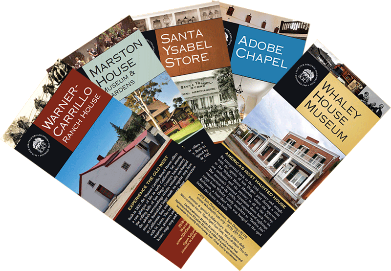
 With SOHO operating more sites and year round architecture and garden tours than any other organization in San Diego County, the time was right to refine our tourist literature. We recently launched an attractive new line of glossy rack cards, one for each of the five sites we operate and manage. With SOHO operating more sites and year round architecture and garden tours than any other organization in San Diego County, the time was right to refine our tourist literature. We recently launched an attractive new line of glossy rack cards, one for each of the five sites we operate and manage.
We want to imprint SOHO's name on the minds of visitors and residents so that we are their first stop and resource for the cultural heritage tourist.
There's a uniform look, format and size to the vertical cards that fit well in the hand. They're anchored on the front and back by SOHO's logo, along with the landmark's name in large letters and emblematic photos. Easy-to-read descriptions and history appear in multicolored horizontal bands, with a different color scheme for each site. Free matching bookmarks are available at each landmark.
The cards target a certain, solid demographic. While so much is electronically now, we've found there is still a large group of people who want their information in their hand on a hard copy, not only on a phone screen. Membership and group tour brochures are to follow using the new designs.
The new look of the rack cards, which will be distributed throughout the west, follows on the heels of the redesigned SOHO websites.
|

